BROOKLYN PUBLIC LIBRARY ACADEMIC CLIENT PROJECT
MY ROLE
UX Research/UI Design
DURATION
3 Week
ADDITIONAL TEAM MEMBERS
Tamika Twiggs Jennings and Robert Houser
CLIENT NEEDS
Increase patron activities and participation on the mobile application and webpage
Seamless branding and accessibility compliance
CURRENT WEBSITE
Branding feels removed from the mobile application and in-branch experiences
Banner distracts patrons, and does not provide detailed information
Word, colors, and icons, sometimes are hard to read and not fully accessible
Younger generation of kids don’t find the need to log onto the website
CURRENT MOBILE APPLICATION
Branding is not aligned with Brooklyn Public Library’s website and in-branch kiosks / experiences
Patrons aren’t engaged
Application could be more user friendly
PROBLEM STATEMENT
How might we adapt current colors to make them accessibility compliant?
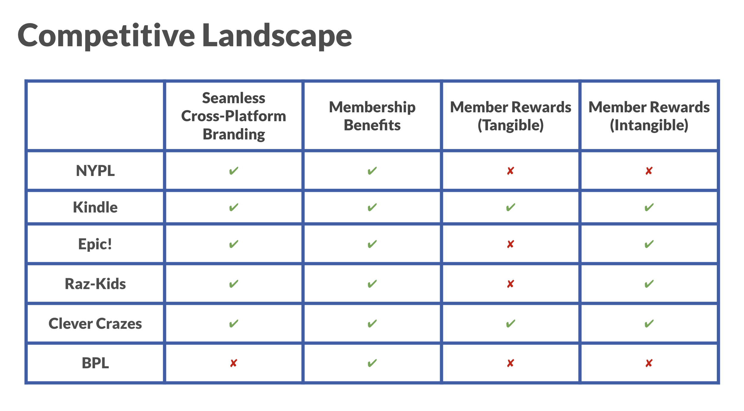
How might we increase patron engagement and encourage desired interactions with BPL?
SURVEYS
Would you be interested in a points/rewards system at the library?
USABILITY TEST RESULTS ON UPDATED APPLICATION AND WEBPAGE
PATRONS DON’T LIKE
Color theme/ inability to choose theme
Featured events are at the bottom and easy to overlook
Patrons like:
Ability to earn points
App is simple and straightforward
Easy to use for children and elders
Added avatar makes it more sociable
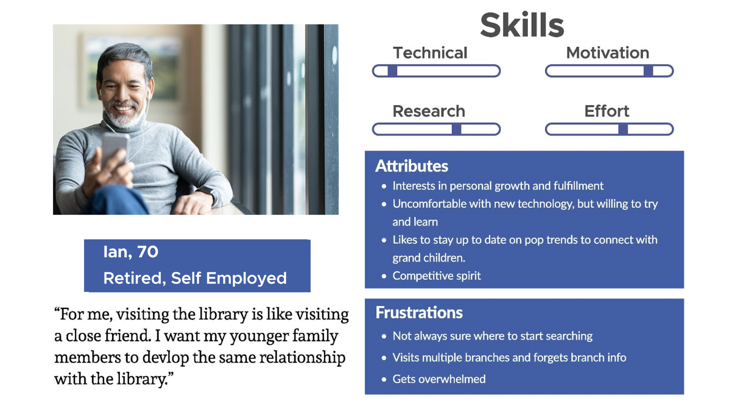
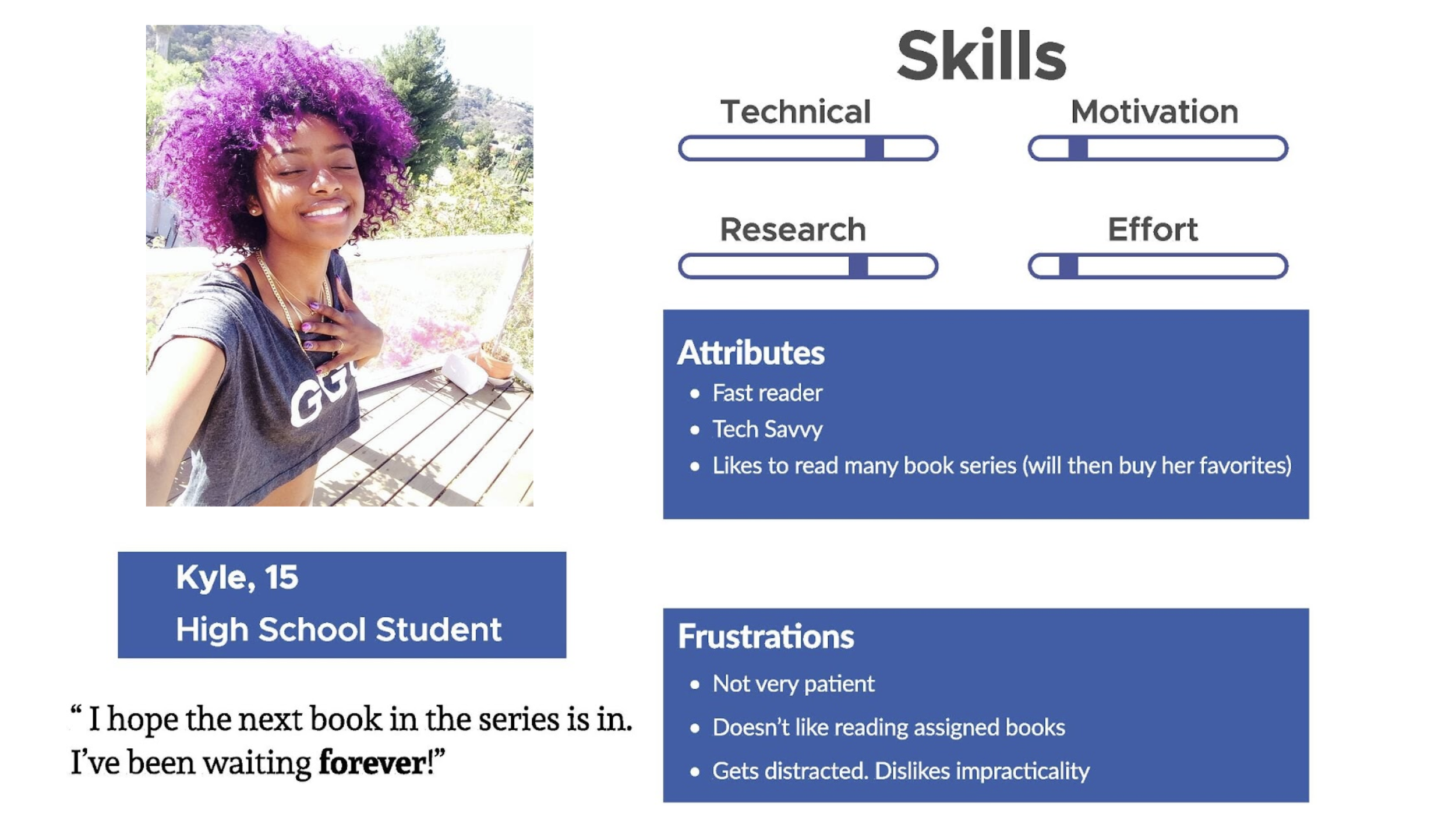
PATRON PERSONAS
LOW FIDELITY PROTOTYPES
WIREFRAMES
Website
Mobile App


